
Fathom Information Design
Summer 2025 - Spring 2027
Visual Craft

CONTEXT
Sole designer
10 weeks
Ongoing development
TOOLS
Figma
R Studio
Cursor
Svelte/JS
SKILLS
Complex Systems
User Trust
Interface Design
Data Viz
CHAPTER 1
In Summer 2025, I rapidly iterated on interface designs in Figma, guided by the core questions scientists ask to uncover meaningful insights from their data.
THE PROBLEM
Powerful outbreak insights, limited by technical expertise.
JUNIPER is a statistical framework that uses genetic data from positive patient samples to reconstruct likely transmission links — including cases that might've not gotten tested (Specht et al., 2025).
1
2
3
4
5
6
7
8
9
10
During interviews with scientiests, I learned that while many were excited by the tool’s potential, JUNIPER is run entirely in the R programming language. This creates a large barrier for epidemiologists and public health staff who aren't familiar with writing custom code or navigating raw statistical outputs.

THE GUIDING QUESTION
Impact
"Amazing. This is a clear endpoint for the project’s goals and this is going to be a major resource for the field."
Pardis Sabeti - Lab PI
"Phenomenal prototype. It's a perfect representation of JUNIPER's outputs and parameters."
JUNIPER Developer
"Night and day—much faster to interpret for investigation." "This is needed, this is amazing. People at the DPH (MA Dpt. of Public Health) want this.”
Senior Scientists
PROCESS OVERVIEW
An iterative design cycle
1
Understand & Define
Combed through papers and ran sample outbreaks
2
User Research
Interviewed lab members and public health workers
3
Feature Ideation
Sketched initial concepts, created a visual user flow
4
Prototyping
Used Figma and AI-assisted prototyping using both simulated and real-world data
5
Usability Testing
Synthesized insights from conversations and interviews with users


User questions informed the system architecture
I collected 30+ user questions from working closely with JUNIPER’s developer and gathering real-world use cases from lab members, members of the MA Dpt. of Public Health, conferences, and scientific literature. This list is ever-evolving, and it’s my basis for ideating, iterating, and weighing design tradeoffs.
A CRUCIAL FINDING
One tool, two very different ways of thinking
Biostatisticians
Researchers and geneticists who apply findings in conferences and government briefings
Goal: Uncover population-level patterns, genetic drivers, and key factors behind disease transmission
Public Health Workers
School nurses tracking a high school outbreak; officials investigating suspicious clusters
Goal: Confirm superspreaders and who-infected-whom; understand general outbreak patterns.
DESIGN DECISION #1
Two investigatory workflows → two views
The transmission network visualization should be the star of the show. I aimed to create the visualization that best addressed user questions, and built other features of the interface around it. I explored two primary transmission layouts, realizing that each conveyed unique insights:
Time-Based
“How fast is it spreading? What are key clusters of interest?”

Suited for pattern identification
Radial
“Who were likely superspreaders? Who likely infected whom?”

Suited for superspreader tracing
For each layout, I adjusted various characteristics throughout 15+ network variations to emphasize the most relevant insights about the network.


DESIGN DECISION #2
Clear, structured visual hierarchy
Dual page view: supporting two mental models
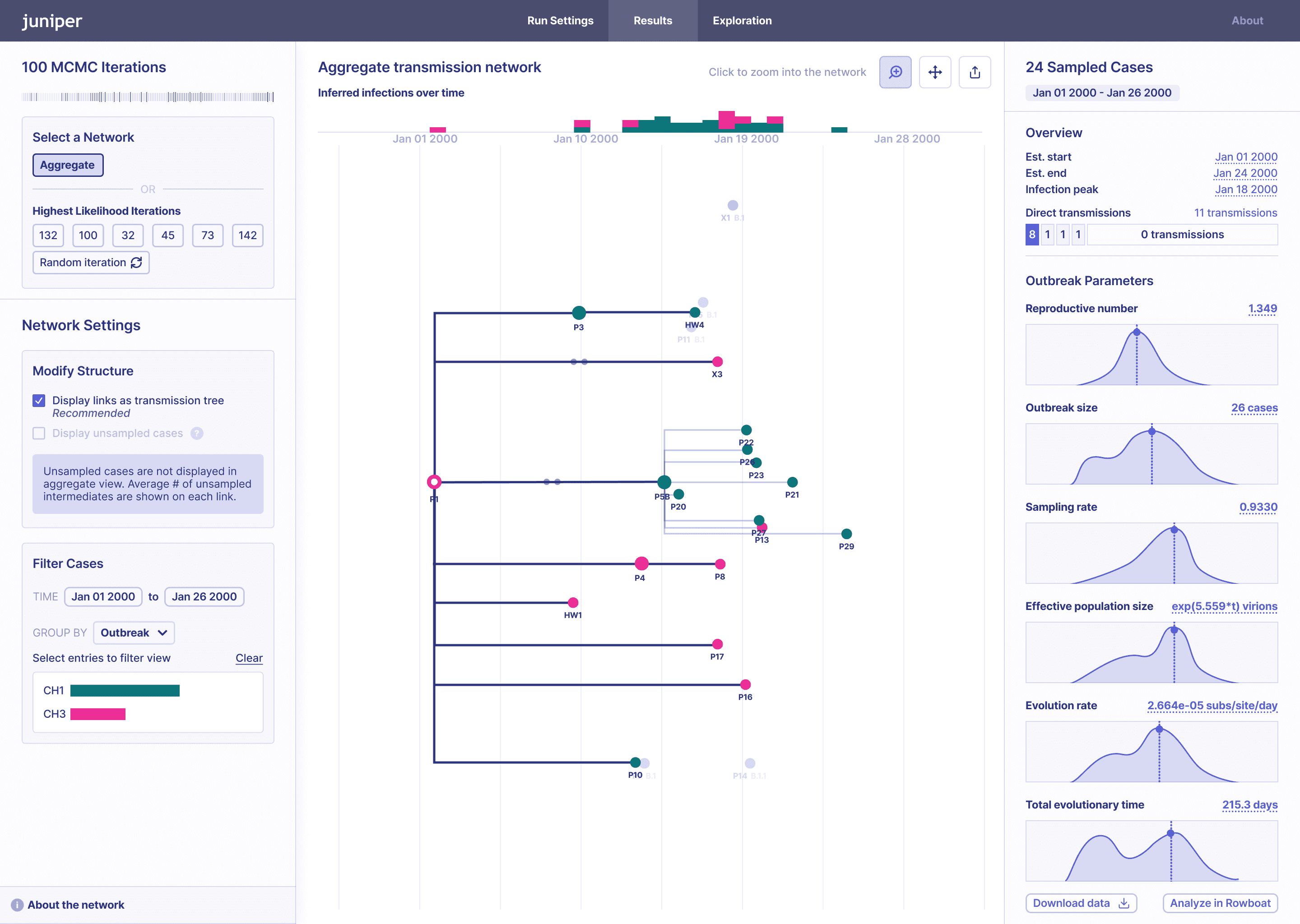
Results: High-Level

Job: Understand how the outbreak is evolving and view lineage, cluster, or metadata-specific patterns.
Time-based layout gets the big picture across. Users see outbreak parameters in the right panel.
Link Details: Transmission-Focused

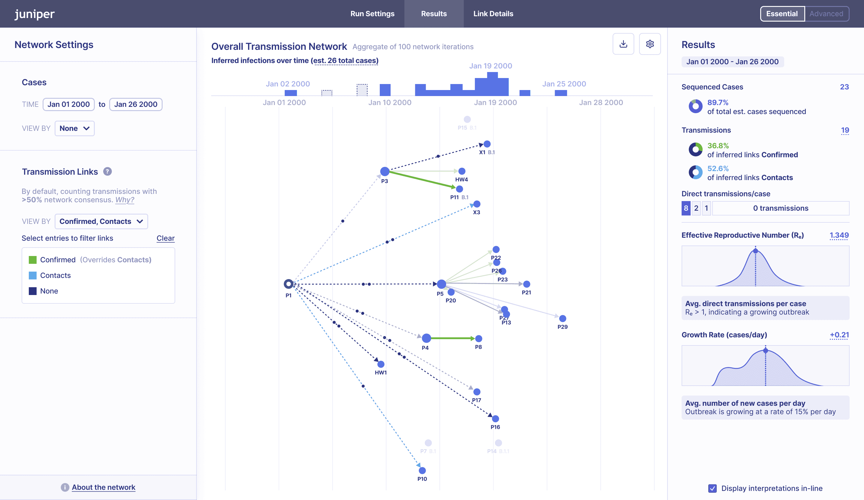
JTBD: Investigate superspreaders and contact tracing or epidemiologically-confirmed links.
Radial layout emphasizes superspreaders. Users can dive into specific cases, sorted by outbreak impact.
USABILITY TESTING FINDING
Non-biostatisticians were confused about the purpose of specific parameters as well as how the different networks were aggregated.
With the two primary user groups in mind, I tailored the interface to focus on ensuring accessibility for non-statistical specialists while maintaining depth for expert analysis.


DESIGN DECISION #3
Side nav: an entry point for investigation at scale


DESIGN DECISION #4
Zoom that adds meaning, not clutter
The most straightforward way to zoom in on a case was simply to provide a labeled, higher-resolution view. But after hearing early feedback, I began to wonder: could this view do more than just magnify? Could it also clarify relationships or even surface new insights?
Iteration 1

Simple zoom-in (with labels)
Easy-to-follow, but doesn't add additional value, especially for smaller networks.
Iteration 2

Organized by relationships
Emphasizes causal links, but may be misinterpreted as time of infection.
Iteration 3

Organized by time
Reintroduces time-based structure, adding more context into infection relationships.
PUTTING IT ALL TOGETHER
Iterate, Iterate, Iterate



Reflection
Simplification is complex
A big challenge was placing each feature in a logical, accessible location while also trying to reduce clutter. Finding the right balance between simplicity and scientific complexity often involves making thoughtful tradeoffs based on rigorous user testing.
Designing for public health requires constant consideration of accuracy and trust—the way something is presented can literally mean the difference between life and death. Defaulting to clarity and protecting against misinterpretation proved to be the most responsible path.
Progress isn't linear.
After so many of iterations, I sometimes felt discouraged, only to realize that an idea from an earlier iteration could actually be the best fit later on. Iteration keeps the door open for rediscovery and refinement!
CHAPTER 2
The first version of JUNIPER was designed around simplified datasets. Working with code and real-world epidemiological data quickly exposed flaws in the mental model, which forced me to rethink the visualization and surrounding UI.
Rather than treating the central network as just another feature, I restructured the platform around the network as the primary investigative tool.
WIP demo: Some features are still in progress, and artifacts from testing remain.
Working with messy data
When I started working on development, the layouts with small outbreaks looked clean…
Figma

Code

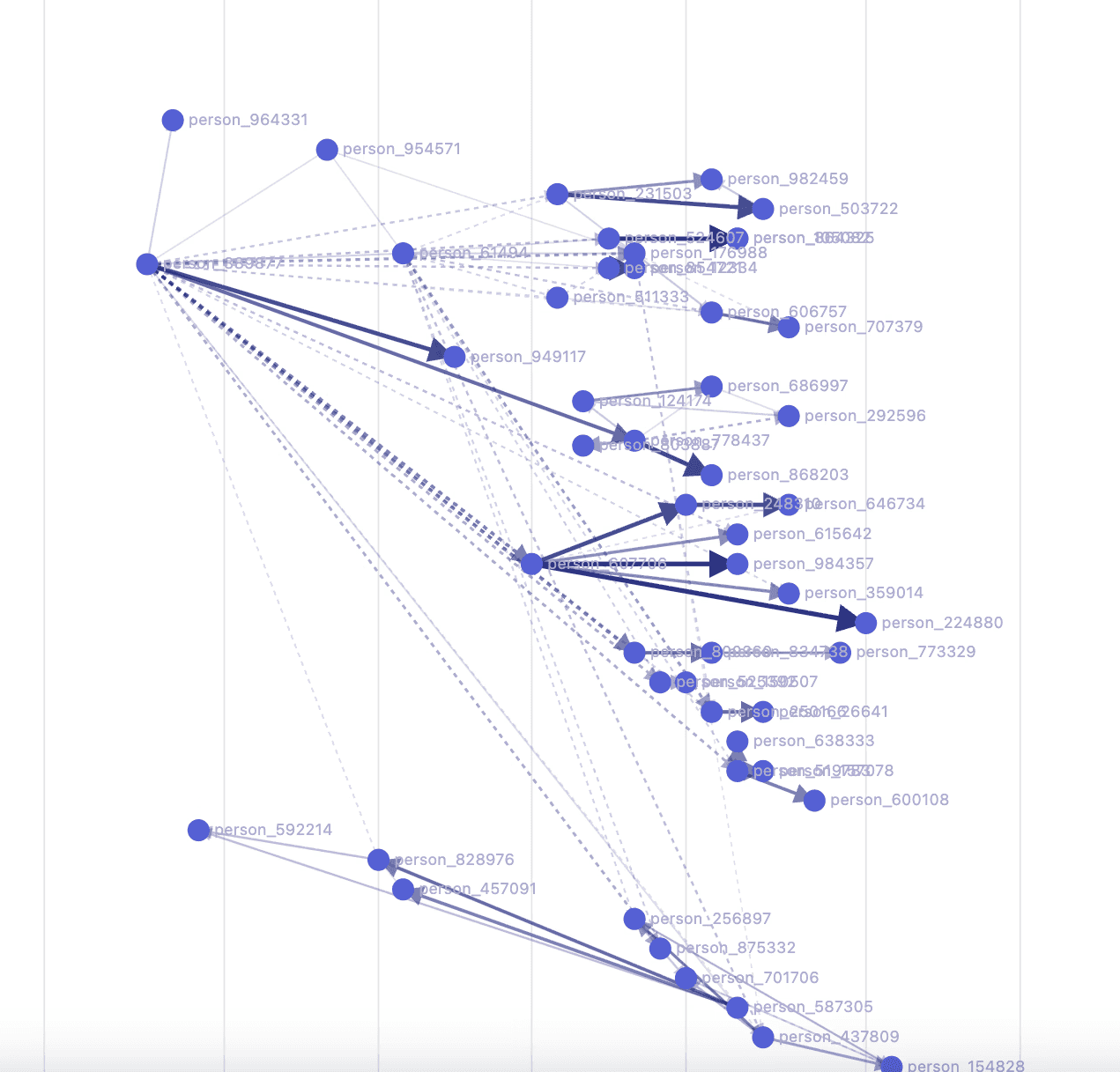
But when I plugged in a variety of real-world datasets, things took a turn for the worse. Cases began to overlap and relationships became difficult to trace, especially for larger outbreaks. I realized that incomplete sampling and irregular transmission patterns exposed limitations that weren’t visible in Figma.


Cleaning the network up
I added toggles directly into the interface to rapidly evaluate transmission layouts based on how well they supported investigation—not just how they looked in a static mockup. I chose the tree structure that best balanced interpretability and scalability.
Once I had the overall structure down, I focused on refining the visual polish. A major area of focus was figuring out how to represent indirect transmissions—when one or more cases between two cases in the transmission chain were not captured in the dataset. While these connections are less certain than direct transmissions, they provide important context for understanding the outbreak, especially when only a small portion of cases have been sampled.

Elbow connectors
Broke up visual hierarchy and made dense networks difficult to scan.

Dotted curved lines
Reduced visual weight but introduced distracting artifacts.

Solid curved lines
Cleaner but provided too much emphasis on indirect transmissions.

Further refinements
I experimented with spacing and color to emphasize direct transmissions and reveal clusters.
Rebuilding the interface around the centerpiece
Once the visualization became the focal point, I reworked the surrounding interface to support investigation rather than compete with it. I also simplified the platform to prioritize the core investigative workflow and keep the MVP feasible within our technical and timeline constraints.
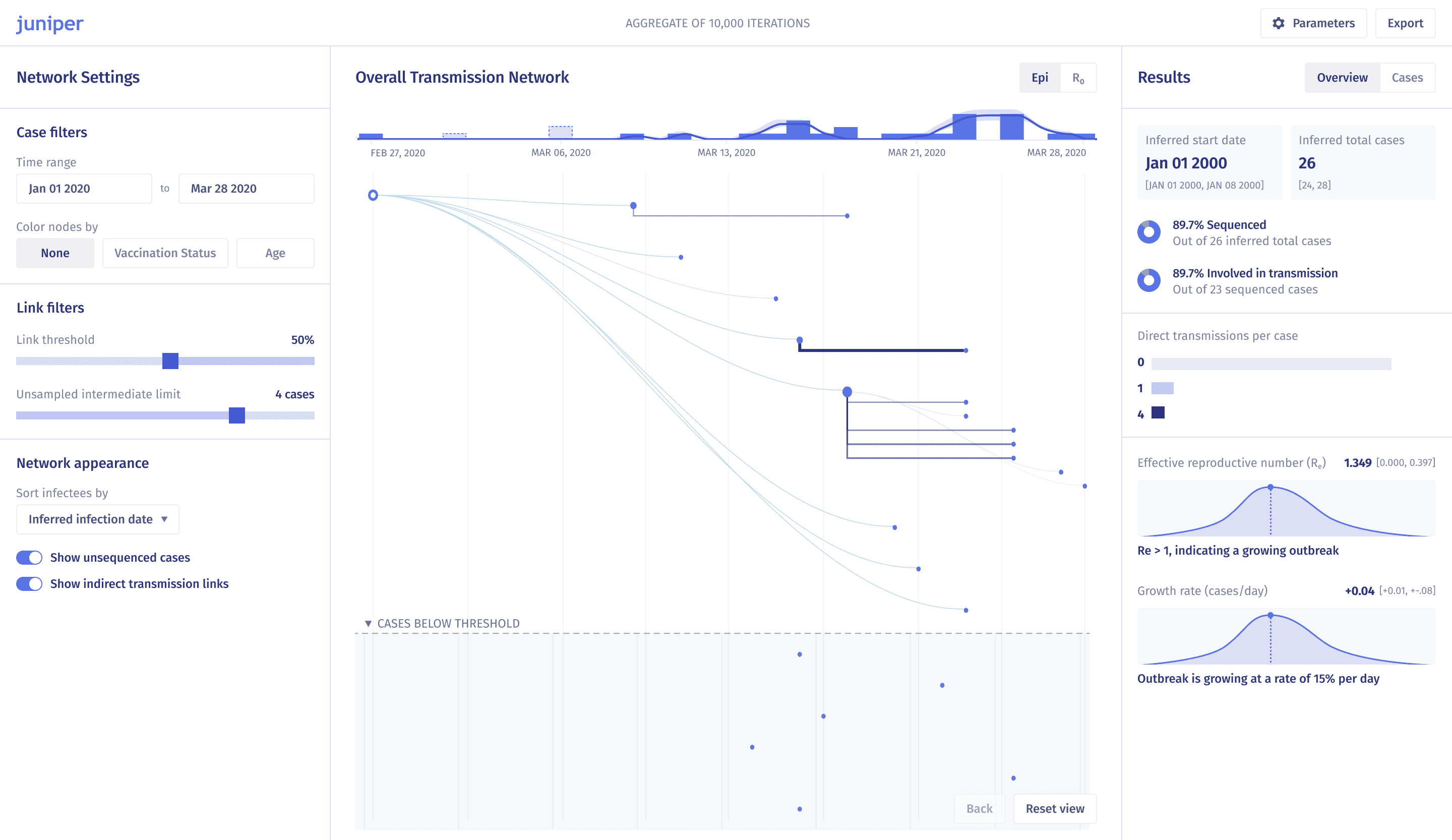
Designing for scale
Large outbreaks introduced another challenge: how do you preserve a useful mental model when the network grows from dozens to hundreds or thousands of cases?
I explored ways to reduce visual clutter without hiding information users might need to investigate an outbreak. This meant balancing density with readability, and detail with progressive disclosure through interaction.
Iteration 1

On hover, users see every possible transmission, including those below the probability threshold.
This created significant visual clutter.
Iteration 2

I simplified the interaction to show only the number of possible infectors and infectees. This reduced clutter, but now users lack enough context.
Final iteration

I combined the two approaches. Users see a summary of possible infectors and infectees, along with which connections fall below the threshold—providing context without overwhelming the view.
Reflection
CHAPTER 3
Outbreak reconstruction is inherently uncertain: probabilistic inference and incomplete transmission histories make definitive answers impossible.
Building on this work, my senior thesis in Computer Science (Mind, Brain, and Behavior) explores the question: How might we help experts reason through uncertainty instead of around it?
I’m investigating different approaches to visualizing uncertainty and testing how they affect the way epidemiologists interpret and reason about transmission patterns.
More to come!
Acknowledgements
I’m grateful to have had the privilege of receiving mentorship and feedback from Ben Fry, Pardis Sabeti, Ivan Specht, Chase Van Amburg, Karlie Zhao, Paul Cronan, Taylor Brock-Fisher, Lydia Krasilnikova, and other members of the Sabeti Lab over the course of this project.
© 2026 Xinyi Christine Zhang