Bringing Mobile Outbreak Insights to Frontline Workers

Fathom Information Design

Summer 2025

Lookout is a real-time outbreak response platform that was critical for visualizing genomic and clinical data during the 2025 mpox outbreak in Sierra Leone, as featured in Time magazine and part of a project that was awarded the $100 million MacArthur 100&Change grant.


Originally built for desktop, on-the-ground public health teams requested a mobile version during the outbreak. I designed an adaptable solution tailored for low-resource settings to be deployed for the broader Lookout system for future outbreak monitoring.

Lookout is a real-time outbreak response platform that was critical for visualizing genomic and clinical data during the 2025 mpox outbreak in Sierra Leone, as featured in Time magazine.


Originally built for desktop, on-the-ground public health teams requested a mobile version during the outbreak. I designed an adaptable solution tailored for low-resource settings that's intended to be deployed for the broader Lookout system for future outbreak monitoring.

Content truncated on mobile. View on desktop for the full experience!

CONTEXT

Designer

3-week side project

TOOLS

Figma

Javascript

HTML & CSS

SKILLS

Mobile IA

Adaptive Workflows

Rapid Prototyping

THE PROBLEM

Powerful outbreak insights, but not on-the-go

Powerful outbreak insights, but not on-the-go

Lookout displays genomic, clinical, and epidemiological data to support real-time public health decision making during outbreaks. It runs on static HTML/CSS/JS for reliability under unstable internet.

While fast to deploy and easy to use, Lookout was built for desktop. On mobile, where many health officials access data in the field, users have to squint at tiny text and figures. This mobile redesign focused on the following guiding principles:

1. Prioritize actionability

Empower responders to adapt to a rapidly-developing outbreak.

  1. Reduce interaction steps

Help responders get to the information they need as quickly as possible.

  1. Preserve trust and interpretability

Work on a web browser, under unreliable system resources, and on low-res screens.

  1. Scale to different outbreak types

Enable rapid dashboard customization for different pathogens and user needs.

TWO DEVICES, TWO STORIES

Users have different goals on desktop vs. mobile

Users have different goals on desktop vs. mobile

Initially, I assumed that responders wanted detail, just in a smaller format. But field interviews showed the opposite — they needed glanceable status updates during active response. This shifted my approach from making responsive layout tweaks to rethinking the purpose of the dashboard, i.e. the story-to-be-told.

I combed through the JUNIPER paper, and ran multiple sample outbreaks to understand the outputs. This exploration helped me define my design guidelines.

Desktop

“Let me dive deep into the data to uncover drivers and clinical patterns"

Mobile

“I need insights on this outbreak that I can act on at-a-glance”

Defining the different Jobs-to-Be-Done shaped how I prioritized content and simplified interactions to adapt the dashboard both visually and functionally to different usage contexts.

INTERACTION REDESIGN

Adapting core interactions for small screens

Adapting core interactions for small screens

Lookout is highly interactive, but many of these behaviors don’t translate well to mobile. Mobile browsers lack hover states, and dragging/swiping can conflict with browser navigation. Tap targets may be too small, and hidden interactions increase cognitive load.

In the redesign, I focused on making key insights visible by default and minimizing the need to tap.

Filter records

Tap charts

Tap filter

Adjust time range

Drag timeline

Tap dropdowns

Reveal details

Hover

Text-based readouts

MOBILE-FIRST CLARITY

Prioritizing actionability under urgency

Prioritizing actionability under urgency

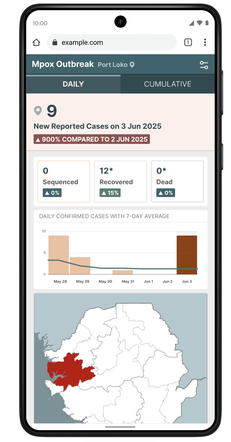
Mobile demands clarity under urgency, so, drawing on real-world use cases from the Sierra Leone mpox dashboard, I restructured Lookout’s layout hierarchy around immediacy and legibility.

Throughout the project, I sought feedback through demoing and testing with Fathom designers and 10+ lab members.

Immediate text-based readouts

Prioritizes changes from prev. day

Immediate text-based readouts

Prioritizes changes from prev. day

Long-term patterns

Prioritizes cumultative epi-chart

Long-term patterns

Prioritizes cumultative epi-chart

Colored header and pin icon

Colored header and pin icon

*denotes placeholder data

*denotes placeholder data

District

Daily

Cumulative

Led with interaction

At the top, users make simple but critical choices: view cases by day vs. cumulative and select their district of interest. Distinct visual cues helped users instantly recognize which view they were in.

Surfaced key stats

Text-based summaries on content cards reduce taps, surfacing the most important numbers upfront. Due to development complexity, I avoided time-range sliders and anchored daily readouts around a 7-day window.

Cut clutter

Complex visuals like patient records and phylogenetic trees didn’t translate well to mobile. Removing them avoided zooming and clumsy navigation.

Deprioritized filters

Filters were important but not urgent. I tucked the tool behind an icon to preserve space and focus.

Improved readability

Increased font sizes and contrast across core components for readability in the field.

Daily

Immediate text-based readouts

View anchored by changes from prev. day

Cumulative

Long-term patterns

View anchored by epi-chart

SCALABILITY

Reusing components for flexible growth

Reusing components for flexible growth

Lookout is meant to be customizable for any outbreak. I reused existing components to support additional diseases, metrics, and data types. This modular approach ensures the design scales to different dashboards without sacrificing clarity.

Reflection

Function over flourish

Lookout is driven by function. By stripping away consideration of aesthetics and animations, this truly taught me the power of considering design at their functional core. Even small details—like choosing raw counts vs. percentages—changed the clarity of insights.

Designing for messy data

Real-world epidemiological data is incomplete and inconsistent. Some features I wanted (e.g., geographic trend readouts) weren’t possible with available data. This forced me to design around data constraints.

Collaboration defines feasibility

Many of my initial ideas ran into technical limits. Working with developers shaped my thinking: good design anticipates implementation reality.

Acknowledgements

I’m grateful to have had the privilege of receiving mentorship from Ben Fry, Pardis Sabeti, Chase Van Amburg, Karlie Zhao, and Ellory Lanning over the course of this project.

© 2026 Xinyi Christine Zhang