Personal project
Dec 2025
CONTEXT
Sole designer
2-day design sprint
TOOLS
Figma
SKILLS
Feature ideation
Interaction Design
Rapid prototyping
THE PROBLEM
The current Focus feature lacks context for others
When someone is on Focus mode, an initial call goes straight to voicemail. Focus status isn't listed on Contact cards, so callers don’t know why their call failed (dead phone, intentional silence, or interruption risk). This ambiguity creates anxiety and can spur repeat calls that may disrupt important moments (if repeated calls aren't disabled in settings).
I hypothesized that providing some indication of Focus status before the initial call is even made can reduce social friction.

THE BIG QUESTION
How might we communicate silence?
Silence needs context. My goal was to design a a minimal but expressive status layer that:
Reduces caller anxiety
Prevents unnecessary interruptions
Treats silence as a communicative state—not an absence
My final designs were guided by three main principles:
Privacy
Users can always choose to keep their Focus status hidden
Visibility
Focus status should be surfaced in all touchpoints
Intent signalling
Give users the opportunity to express why they're in Focus
PROCESS
Many of my projects have been 0→1, so I was intentional about designing within an existing system. I built wireframes using iOS 26 Figma kits, recreating core screens to closely match native patterns and interactions. I then identified current gaps in cross-user status visibility.

KEY DESIGN DECISIONS
On the recipient side, different Focus modes carry different privacy needs — users may not want their status exposed. I introduced granular controls in Settings that allow users to toggle the visibility of the Focus name and duration, as well as choose who can see it.
When both toggles are off, the system defaults to a generic “Focus” label. This preserves privacy without undermining the status signal, ensuring the feature remains informative.
I began by exploring how Focus status should surface when initiating a call from Contacts. I established a clear visual hierarchy: contact name first, status second, actions last. A small status pill beneath the name proved too easy to miss, while a modal interruption felt overly disruptive. In the end, I chose to envelop the call actions in a darker background, creating a subconscious pause point. This provides enough friction to prompt reconsideration without blocking calling intent when the recipient’s Focus mode is active.
Iteration 1

Iteration 2
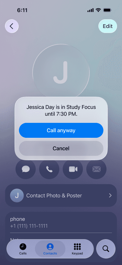
Iteration 3

Contacts

Messages

Keypad

Siri

"This would be so helpful because I literally never know whether [friend] is on DND or just hanging up on me."
"Wait, I'm confused — how is this not already a feature?"
(It isn't. Surprising, right??)
© 2026 Xinyi Christine Zhang